Picture the monthly dashboard of a leadership team: 97 KPIs, twelve tabs, a color code nobody remembers. Everyone nods in the meeting. Nobody uses it to decide.
I wanted to show, on an extreme and public case, that you can do the opposite: take 34,892 French communes, each described by 97 social indicators, and compress them into one chart. Without cheating, and without hiding what the compression costs. One sentence of context first: a commune is a French municipality, the smallest administrative unit in the country, and the colors you'll see come from round 1 of the 2022 French presidential election.
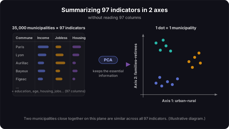
The method is called principal component analysis, PCA. The raw file, the "dossier complet" from INSEE (the French national statistics office), lines up about 1,900 columns per commune; after cleaning, 97 remain genuinely comparable. PCA takes that unreadable table and builds new axes that concentrate the information. You no longer scan 97 columns. You look at 2 dimensions. It isn't magic. It's geometry.
A projection is a shadow
Take a three-dimensional object, a chair. Shine a light on it: you get a shadow on the wall. The shadow is flat, it lost an entire dimension, and yet you still recognize the chair. PCA does exactly that with data. It projects a 97-dimensional object onto a wall that only has 2.
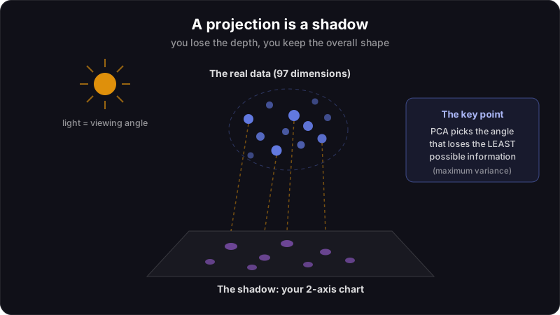
Everything hinges on the angle of the lamp. Lit from above, the chair casts a shapeless blob; lit from the side, it becomes a chair again. PCA computes the angle that distorts the least, the one that preserves the most differences between communes.
The analogy has a limit, and it deserves naming right away: a shadow loses depth without telling you. PCA puts a number on the loss. Here, 71% of the information stays outside the chart. We'll come back to it below, with the chart that proves it.
How to read this kind of map
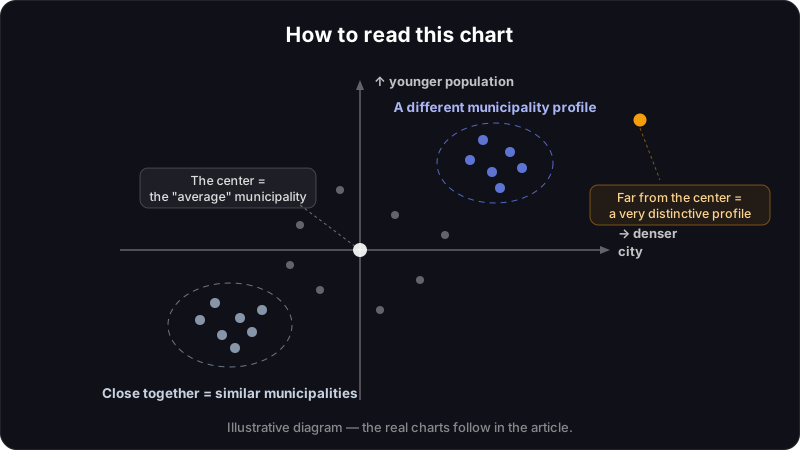
Three rules, not one more. Two communes close together on the map have similar social profiles, even if one sits in Brittany and the other in Provence. A commune far from the center has a marked profile, atypical on at least one axis. And the center is the average: the commune that looks like France as a whole.
A PCA doesn't tell you what to think. It shows you where to look.
On the French data, the two axes read almost naturally. The first opposes rural, homeowner France to dense cities and social housing. The second separates aging communes, where retirees dominate, from towns driven by young working families.
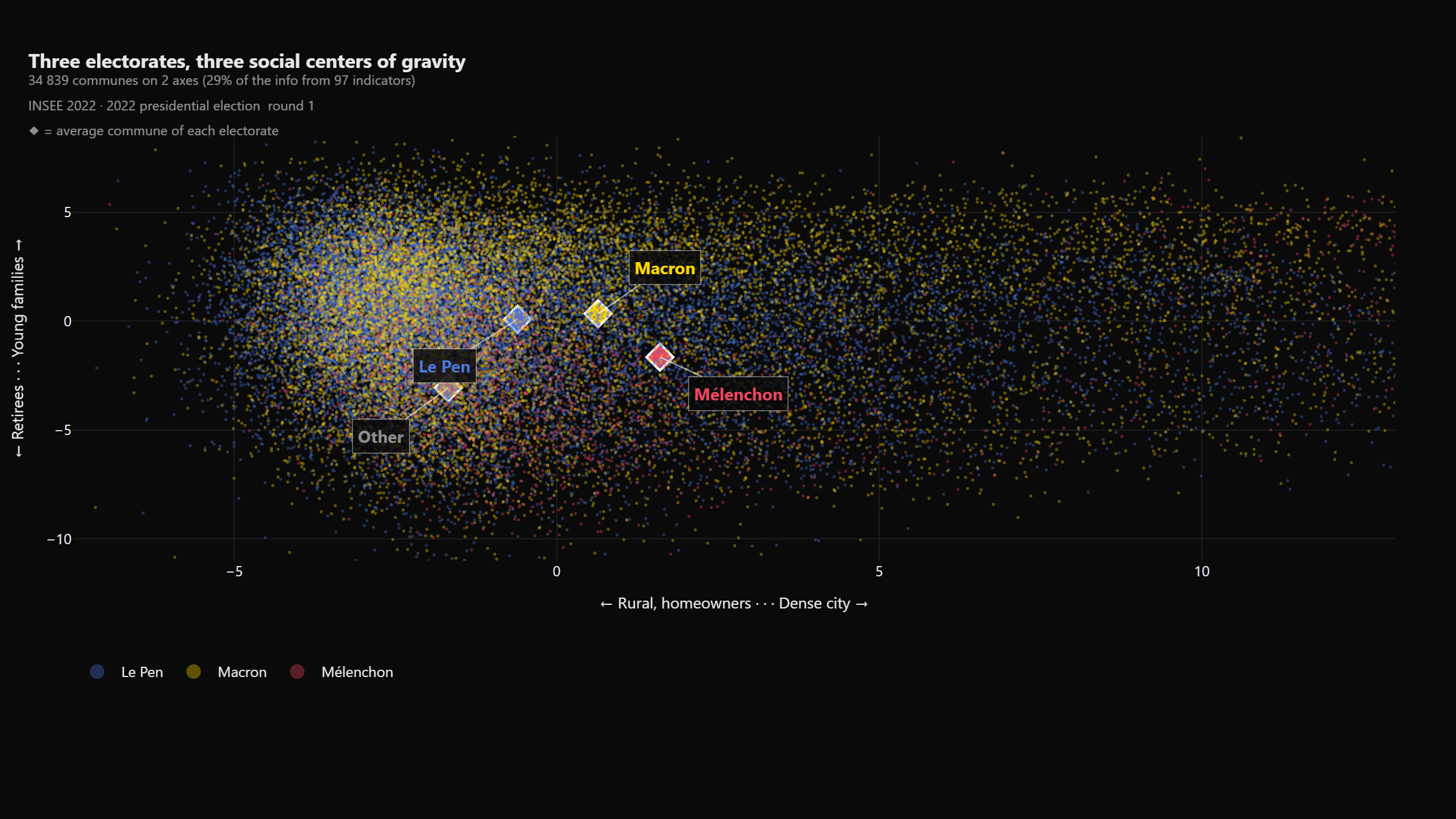
34,839 communes, one first round, one map
Every dot below is a real commune (34,839 of the 34,892 have a matched round 1 result), positioned by its social profile and colored by the candidate who came first in round 1 of the 2022 presidential election.
- What to look at: the diamonds ◆, which mark the "average" commune of each electorate. Every dot is a commune; hover to see its name.
- What to conclude: the electorates occupy different social territories. The vote follows social geography.
- What NOT to conclude: you are not looking at individual voters. A "Le Pen" commune is one where Le Pen came first in round 1, not a unanimous one.
The orders of magnitude are worth stating: Le Pen came first in 19,978 communes, Macron in 11,738, Mélenchon in 2,761, another candidate in 362. These colors are a factual overlay, the official round 1 results, nothing more; later in this series, I'll show how this exact chart can serve three opposed political narratives.
How much information did we lose along the way?
The next chart answers the uncomfortable question: what is left of 97 indicators when you keep only 2 axes?
- What to look at: the first two bars, and the curve that accumulates information axis after axis.
- What to conclude: 2 axes concentrate about 29% of the information (18% for the first, 11% for the second). Enough for a useful map.
- What NOT to conclude: that the rest is noise. The remaining 71% exists: a dot that looks like an outlier on this map can be perfectly normal on an axis you're not seeing.
To fix the scale in your head, it takes 10 axes to reach 50% of the information. The compression is real. It is never free.
The limits, no hedging
This map captures 29% of the information, not the whole of France: two communes stacked on top of each other here can differ sharply on dimensions not shown. It exposes correlations, never causes: a social profile doesn't make anyone vote, it travels alongside the vote. And it reasons at commune level: we know nothing about any specific voter, and believing otherwise has a name, the ecological fallacy. And the 2 axes were chosen by the variance in the data, not by any political theory: they would exist unchanged if no election had ever happened.
Episode 2: which variables say the same thing
97 indicators also means plenty of duplicates hiding under different names. The next episode opens the hood with the correlation circle: the tool that shows which variables tell the same story, and which ones carry genuinely new information.
I do the same work on business data: client portfolios, branch networks, product lines. If your dashboards look like the one at the top of this article, here is how I work.